.png?height=120&name=Logo_Prompto_2022_white%20(2).png)
Short answer: Define USP items and add them as spots in the tour.
Intro
USP's, or info spots as some people call them, are a great way to showcase the value of your neighbourhood or site without creating endless website scroll pages. By adding this interactivity to your images, the viewers will understand the highlights of your project without the complete sales pitch, increasing conversion.
Part 1 - Creating your USP's cards.
This setup is extremely easy.
You can add as many USPs as you like and drag and drop them in the showcase. If you change one USP, it will update in all spots in the showcase.
Head on over to the USP tab in your project and create your first USP
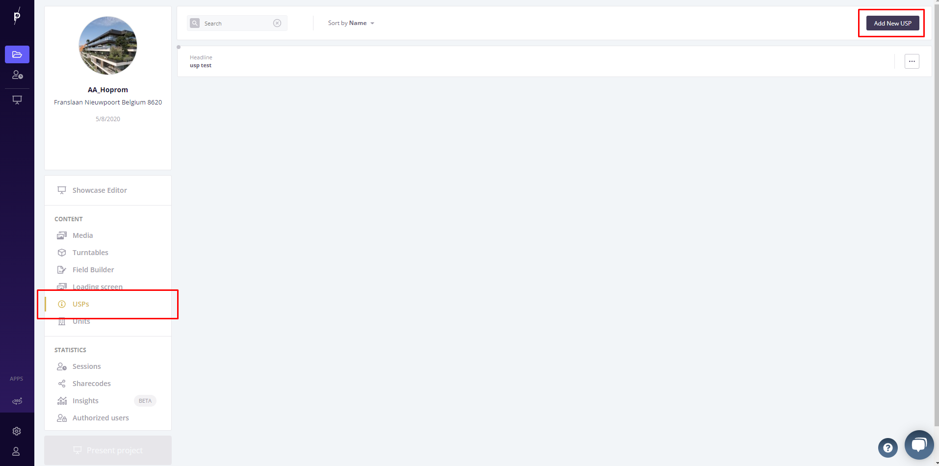
There are three main areas to fill out for each USP
- Title
- description
- image or video [Optional]
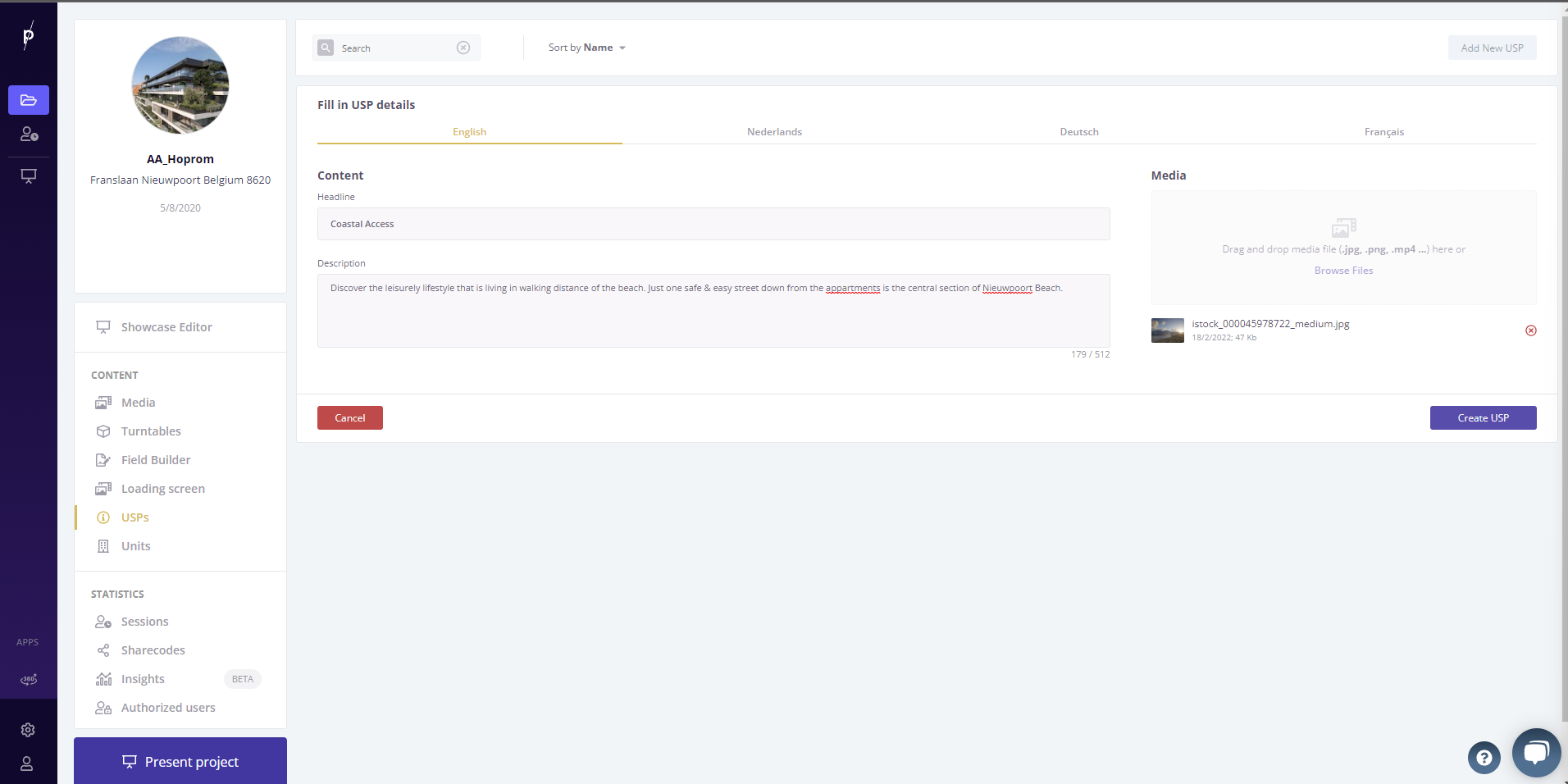
If you want to make your showcase localized, a.k.a. multi-lingual, make sure to change the title & description in each language tab. Now hit create USP and you're good to go.
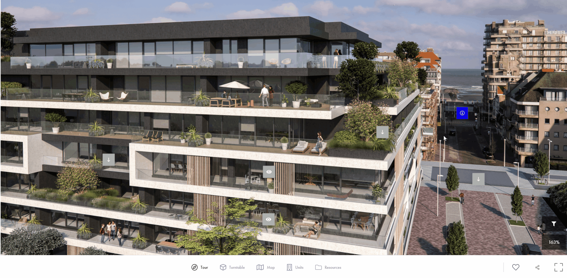
Part 2 - Integrate in the showcase tour
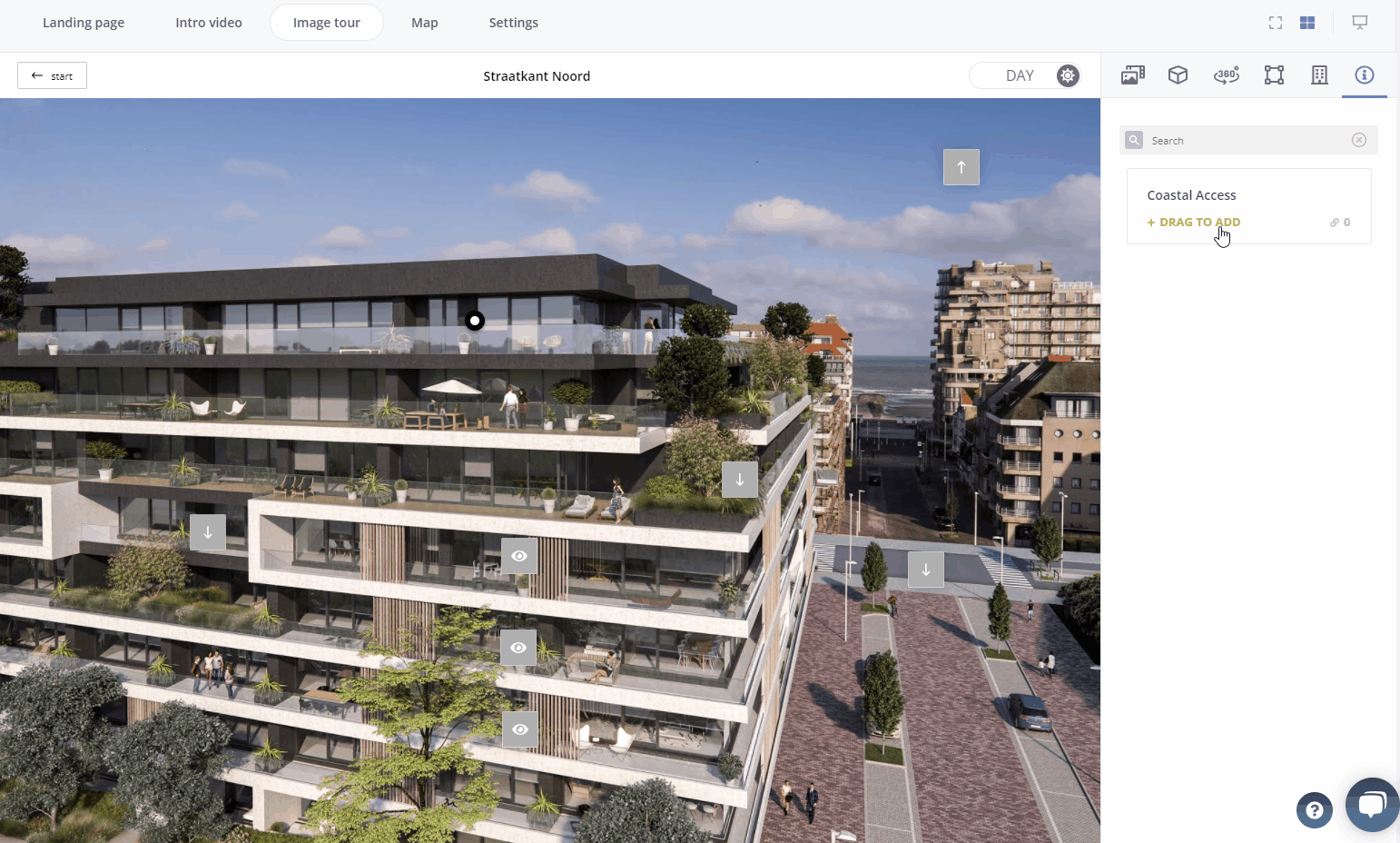
Head on over to the showcase editor - image tour tab.
In your component library to the right, you'll find the USPs listed under the info icon.
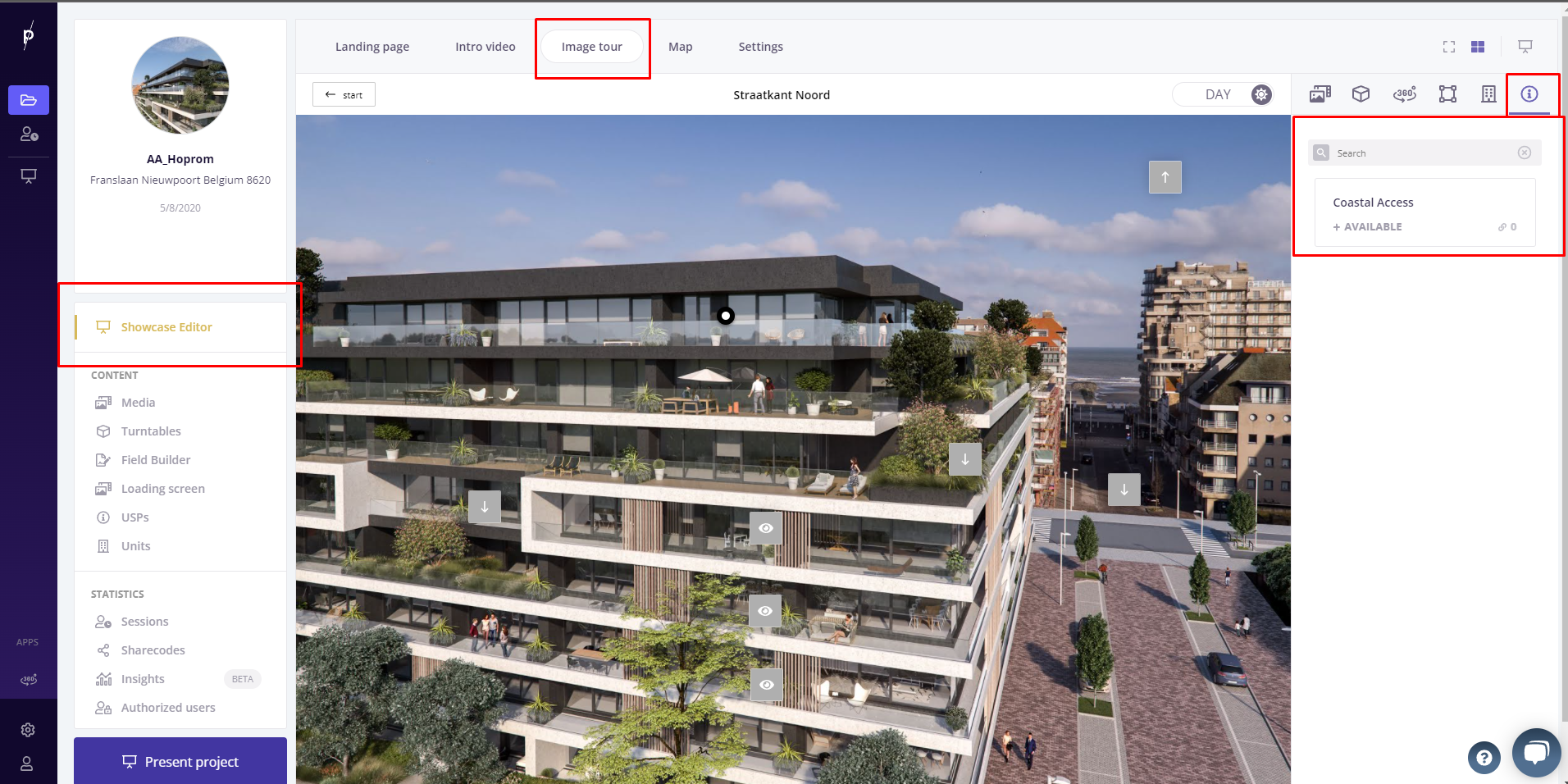
Simply drag-n-drop the usp like any component from the component library.
TIPS 🚀🚀🚀
TIP1: Use stock images in USPs to guide the overall feeling of your project without investing in expensive CGI.
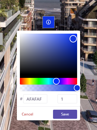
TIP 2: Don't forget you can change the color & icons of your spots. Grab some attention with a well picked brand color.